Components/ Tooltip
The tooltip is designed to handle a wide range of scenarios.
Features
- Smooth size and position updates with configurable fade settings
- Smart auto-positioning that prevents tooltips from going off-screen
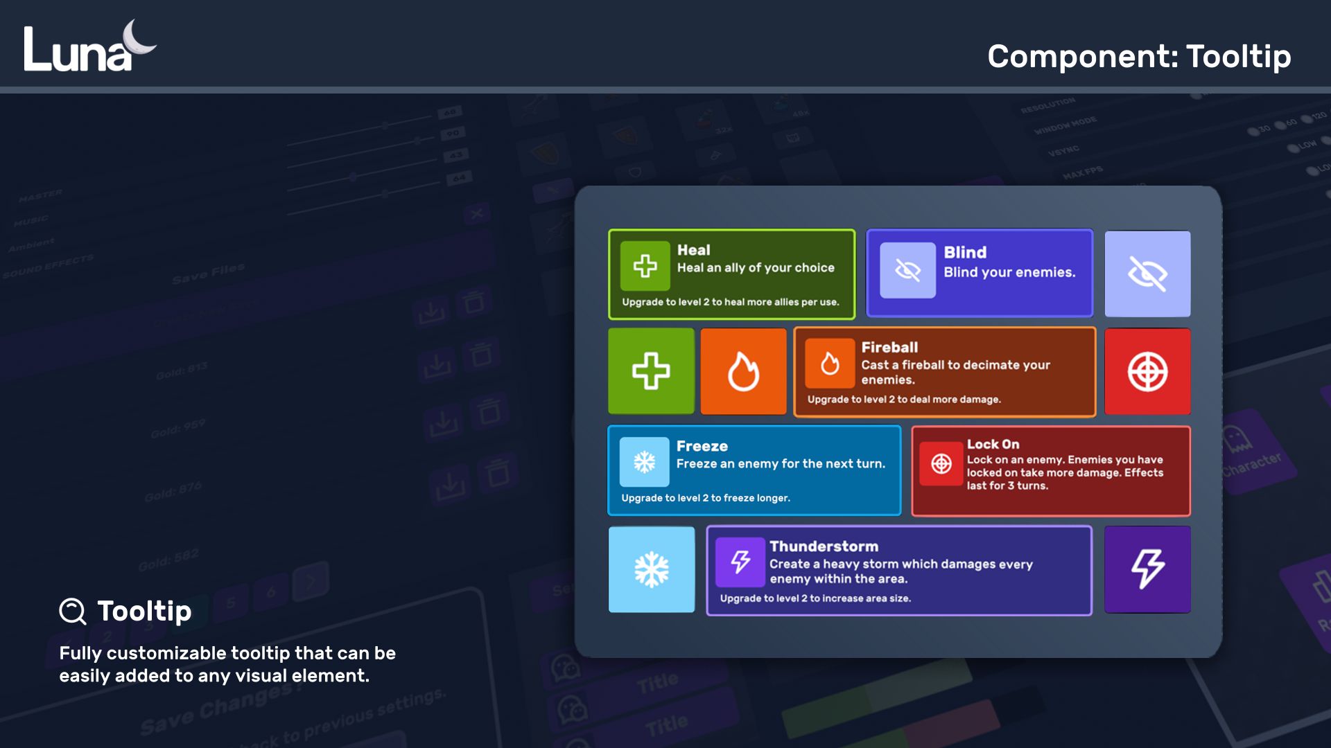
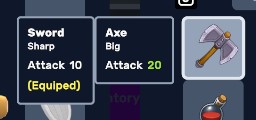
- Display multiple columns simultaneously, perfect for comparing items in inventory with equipped gear
- Support for nested tooltips with customizable locking behavior
- Object pooling for optimal performance with many tooltips
Attributes
| Attribute | Description |
|---|---|
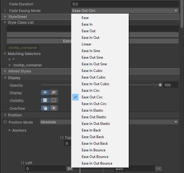
| Fade Duration | Duration of fade animation. |
| Fade Easing Mode | Easing mode of fade animation. |
Tooltip Guide
Class Controls
Position
Apply these USS classes to the VisualElements that will display a tooltip when hovered over or focused to adjust the tooltip's position. Default value is top.
| Class | Description |
|---|---|
| tooltip-left | Position tooltip to the left of the VisualElement. |
| tooltip-right | Position tooltip to the right of the VisualElement. |
| tooltip-bottom | Position tooltip to the bottom of the VisualElement. |
Follow Mouse
| Class | Description |
|---|---|
| tooltip-follow | The tooltip will position itself relative to the mouse instead of the VisualElement and will move along with the mouse. Position class controls still apply. |
TooltipController
TooltipController is a MonoBehaviour that keeps track of Tooltip element.
TooltipManipulator
Add the TooltipManipulator to the VisualElements you want to display a tooltip for when they are hovered over or focused.
This will display the tooltip we created when myElement is hovered over or focused. As you can see, the Tooltip itself is very simple.
Constructor
| Name | Type | Description |
|---|---|---|
| parent | GameObject | The tooltip will automatically close when this GameObject is disabled. |
| tooltipController | TooltipController | Reference to the tooltip controller. |
| setup | TooltipContainerSetup | Container setup for a column. See below for details. |
TooltipContainerSetup
| Name | Type | Description |
|---|---|---|
| image | VisualElement | VisualElement to place in the image slot. |
| title | VisualElement | VisualElement to place in the title slot. |
| body | VisualElement | VisualElement to place in the body slot. |
| bottom | VisualElement | VisualElement to place in the bottom slot. Use this slot if you don't want any prior layout. |
| colorBackground | UIColor | Change tooltip container's background color. |
| colorBorder | UIColor | Change tooltip container's border color. |
| maxWidth | int | Change tooltip container's max with in pixels. |