
Quick Start
Requires Unity 6000.0 or later. Luna's
package.jsondeclares this version; Unity will refuse to import on older editors.
Luna's 10-minute orientation: install, play the flagship demo, then tour the pieces that make it work — the theme stack, what ships in Essentials, and what ships in Showcase. By the end you'll know which file does what and where to look when you start authoring your own UI.
1. Install + import
com.cupkekgames.luna — one Asset Store package. Foundation dependencies (singletons, pool, fadeables, keyvaluedatabases, prefabloaders, editorui, editorinspector, packagemanager, input) come bundled. No scoped registries, no manifest edits.
After install, open Window > Package Manager > In Project > LunaUI. Under the Samples tab, click Import on:
- Essentials — Luna's design system: theme, fonts, Panel Settings, USS effects, the bootstrap prefab, shared UXML primitives. Import this first.
- Showcase — every Luna component plus the flagship game-style UI shell.
(Skip the GameFull entry for now — it's a separate, larger journey covered on its own page.)

Both land as siblings under Assets/Samples/LunaUI/<version>/.
2. Press Play on the Showcase
Open Showcase/LunaShowcase.unity — the flagship demo, a complete game-style UI shell with tabs, modals, overlays, and responsive layout switching. Press Play. The Luna theme renders automatically, Panel Settings is pre-wired, scripts run, audio plays.

Also worth opening once:
Showcase/LunaStorybook.unity— sidebar-driven per-component browser. Flip through Toggle, Slider, Buttons, ListView, etc. in a single scene.
3. Anatomy of a Luna scene
With LunaShowcase still open, peek at the wiring. Three references compose the entire theme:
UIDocument (component on a scene GameObject)
   │
   └─→ Panel Settings asset → LunaPanelSettings.asset
                                  │
                                  └─→ Theme Style Sheet → LunaUIDemoTheme.tss
                                                              │
                                                              └─→ @import chain
                                                                  • Color tokens
                                                                  • Size tokens
                                                                  • Component styles
• Layout utilities- In the Hierarchy, click the
LunaShowcaseroot GameObject (the other root,FullUiDemoDependencies, just holds shared deps). Its Inspector has a UIDocument component, and the component's Panel Settings field points atEssentials/Theme/LunaPanelSettings.asset. - Click the asset reference in that field — Unity highlights the asset in the Project window. Select it there so its Inspector opens. The Panel Settings Inspector has a Theme Style Sheet field pointing at
Essentials/Theme/LunaUIDemoTheme.tss. - Double-click the TSS to open it in your editor. It's a USS file using
@importto layer Luna's design tokens (colors, sizes, components, layout, text) into one root theme.
That's the chain. Swap one Panel Settings reference and the entire UI re-themes. Override the TSS variables in your own USS to re-skin without touching component selectors. See Theme Stack for the full story.
Why this matters for your own UI: any UXML file rendered through a
UIDocumentpointing atLunaPanelSettingsinherits the full Luna theme for free. Standard UITK controls (<Button>,<Slider>,<Toggle>,<TextField>) auto-style with no extra USS. You'll see this happen yourself on the First View page.
4. What's in Essentials
Essentials is the genuinely reusable kit — import it standalone if you only want the design system + bootstrap setup. Folder by folder:
| Folder | What's in it |
|---|---|
Theme/ | The design system root: LunaUIDemoTheme.tss, LunaPanelSettings.asset (screen-space) and LunaPanelSettingsWorldSpace.asset (world-space), UITextSettings.asset (SDF font fallback chain), Font/LocalizedStyles/UIEffect_Flair USS files |
Effects/ | Luna's filter shader assets (LunaFilter, UIEffectSettings) — power the glow/outline/shadow/gradient UI Effects |
Input/ | Input action map + Luna's icon database (the keyboard/gamepad glyphs used by InputPrompt) |
UXML/Components/ | Reusable UXML primitives — ChoicePopup, Tooltip variants, Pagination, Notification, SaveLoad, ReturnButton |
UXML/Modal.uss | Shared modal stylesheet |
Prefabs/LunaUIManager.prefab | The bootstrap manager — instantiate once per session; persists across scenes; every view subscribes to it for focus + input |
Audio/ | Starter UI sounds (click, hover) + an audio mixer |
Sprites/socials/ | Discord / Steam social-button icons (used by Showcase + GameFull main menus) |
ScriptableObjects/TransitionPresets/ | Reusable transition-animation preset assets (Attention, Base, Feedback, Loading, Modals, Notifications, Transitions) |
Scripts/UI/TooltipDatabaseExample.cs | Singleton tooltip database referenced by Showcase + GameFull demos |
5. What's in Showcase
Showcase is two scenes plus a folder of single-feature specials.
| Scene / folder | What it demonstrates |
|---|---|
LunaShowcase.unity | Flagship game-style UI shell — tabs (Home, Heroes, Quests, Shop, Leaderboard), modals, overlays, responsive layout switching. The headline scene; the one you just played |
LunaStorybook.unity | Sidebar-driven per-component browser. Toggle, Slider, Buttons, ListView, etc. in one scene — flip through every basic component without opening 25 separate scenes |
Components/ | Single-feature scenes that need specific setup — DragAndDrop (world-space), InputPrompt (local multiplayer), brand-variant ProgressBars (LeagueOfLegends / MultiPass / Overwatch), RadialProgressBar variants, Tooltip variants, Effects (Playground / Presets / Showcase), TransitionAnimation, ResponsiveDemo, UIRender, Inventory, RPGDemo, LocalizationDemo (requires the Unity Localization package — see Optional dependencies below) |
The Samples page catalogues every component scene with deep-links.
Optional dependencies
-
Unity Localization — required by the localization data shipped under
Samples~/GameFull/Localization/(14 locale assets, string tables, theme USS, Japanese SDF font). After installing, set active locale settings inProject Settings > Localization.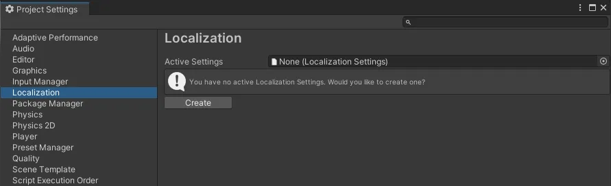
-
Ink Unity Integration — required by the Ink Visual Novel demo (in the
com.cupkekgames.inkbridgesibling package, not Luna). Install separately from Inkle's GitHub release.
The two editor windows
- Package Manager (
Tools > CupkekGames > Package Manager) — for installing CupkekGames sibling packages from the UPM scoped registry. Not needed for the Showcase workflow above; only matters for GameFull and standalone sibling packages. - LunaUI Panel (
Tools > CupkekGames > LunaUI Panel) — auto-opens after sample import. Shows install status, scene wiring checks, Unity dependency checks, troubleshooting tips.
See Architecture & Distribution for the package map.
Where next
- First View — author your own
UIViewComponentand watch the theme apply itself to your standard UITK controls. The natural next step. - Components — the drop-in widgets Luna ships (Button, Slider, ProgressBar, Tabview, Tooltip, …). Browse before you build.
- Views — complete pre-built screens (Main Menu, Pause, Settings, Save & Load, Credits). Often you can extend a Luna view instead of writing your own.
- GameFull sample — the separate journey: installs ~20 sibling packages (data, gamesave, rpgstats, inventory, settings, resources, …) and ships a complete game shell with inventory, save/load, RPG stats, and Ink dialogue.
Settings
Theme
Light
Contrast
Material
Dark
Dim
Material Dark
System
Sidebar(Light & Contrast only)
Font Family
DM Sans
Wix
Inclusive Sans
AR One Sans
Direction