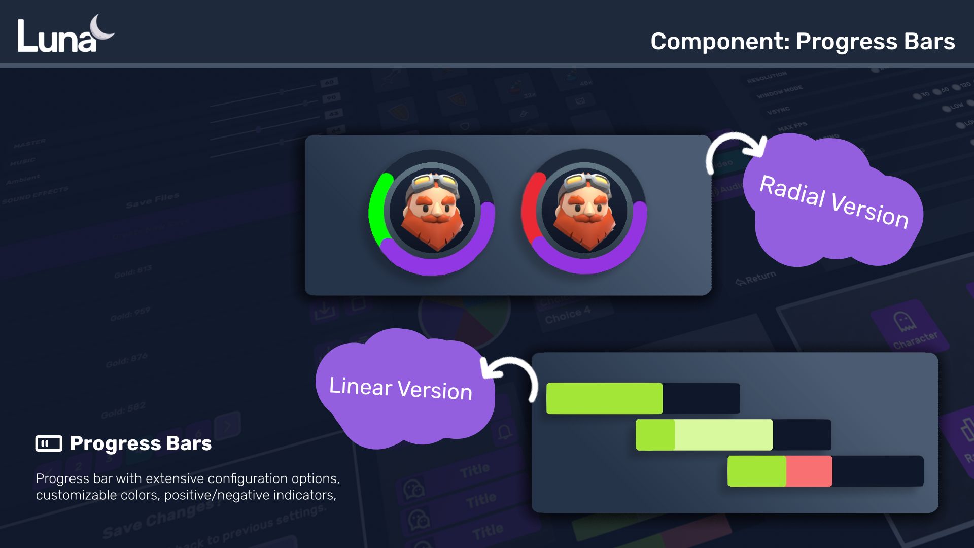
Components/ Radial Progress Bar
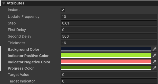
Attributes
| Attribute | Description |
|---|---|
| Instant | Next changes on Target Value and Target Indicator will be shown instantly. |
| Update Frequency | interval in ms |
| Step | How much length progress bar moves per update. |
| First Delay | Delay before the first bar starts to move. First bar can be main bar or indicator bar, depending on the change. If change is negative, main bar moves first followed by indicator bar. If change in positive, indicator bar moves first followed by main bar. |
| Second Delay | Delay before the second bar starts to move. First bar can be main bar or indicator bar, depending on the change. If change is negative, main bar moves first followed by indicator bar. If change in positive, indicator bar moves first followed by main bar. |
| Target Value | Target value to move towards for the main bar. A value be between 0 and 1. |
| Target Indicator | Target value to move towards for the indicator bar. A value be between 0 and 1. |
| Thickness | Width of the line that draws the circle. |
| Color BG | Background color. |
| Color Bar | Color of the main bar. |
| Color Indicator Positive | Color of the indicator bar when the change is positive. |
| Color Indicator Negative | LColor of the indicator bar when the change is negative. |
Custom USS Property
You can customize the appearance by overriding these USS properties in your stylesheet.
For quick styling, you can also use predefined color schemes by adding color classes. For example, adding the `primary` USS class will apply the default primary color settings.
Refer to colors to learn about available options.
| Property | Description |
|---|---|
| --radial-progress-bg-color | Background color of the radial progress bar. |
| --radial-progress-progress-color | Color of the main progress bar. |
| --radial-progress-indicator-positive-color | Color of the indicator bar when showing a positive change. |
| --radial-progress-indicator-negative-color | Color of the indicator bar when showing a negative change. |