Progress Bar
Progress Bar family — one shared animation core (ProgressBarData + ProgressBarController), several shapes on top.
This hub covers the family; siblings: Linear · Radial · RPG Demo · Architecture.
Luna provides a powerful progress bar system with smooth animations, multi-segment support, and indicator overlays.
Available Components
| Component | Description |
|---|---|
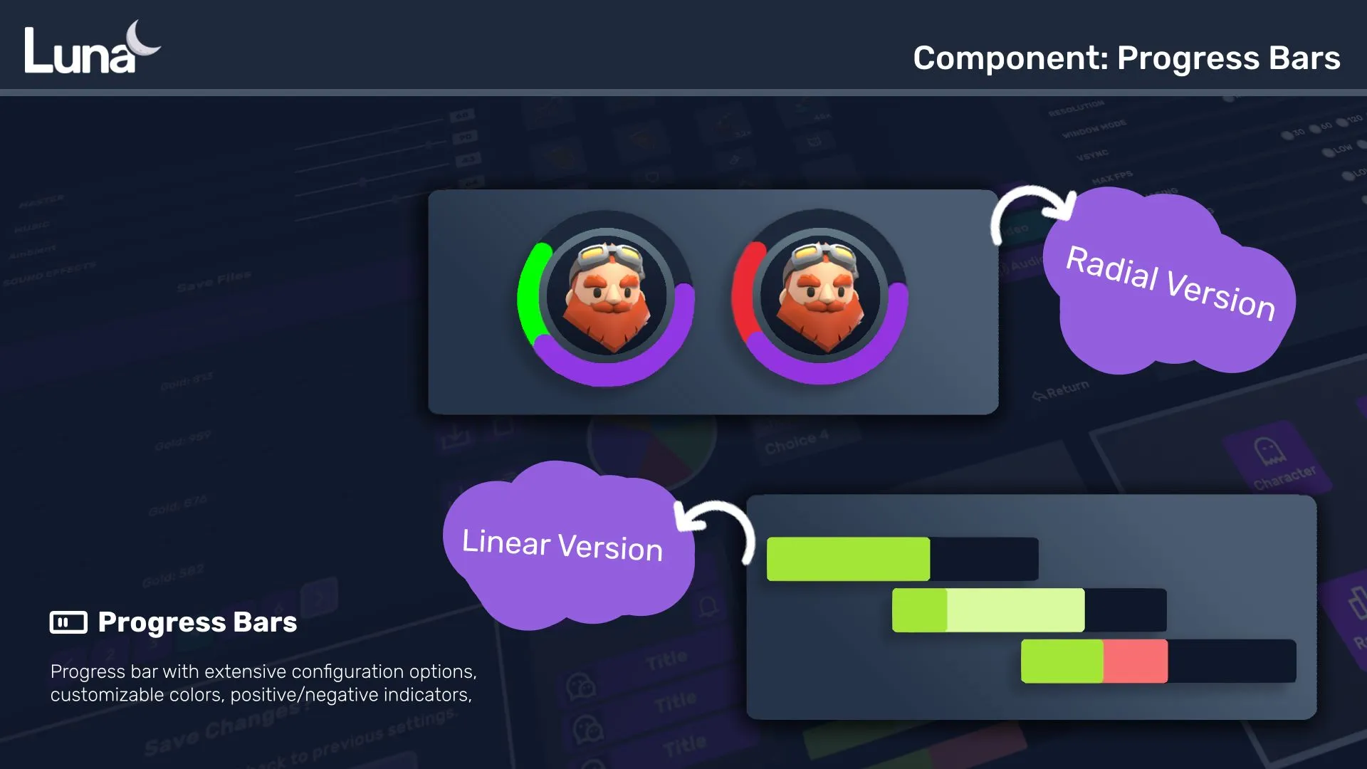
| Progress Bar | Traditional horizontal/vertical bar with fill segments, overlay images, and icon support. |
| Radial Progress Bar | Circular progress indicator with arc rendering. Supports multi-segment displays (Overwatch-style). |
Key Features
- Animated Transitions — Smooth value changes with configurable delays and step sizes
- Indicator Bar — Shows previous value during changes (damage preview, heal preview)
- Multi-Segment — Stack multiple progress fills with different colors
- USS Styling — Full customization via USS properties and color classes
Quick Start
<ui:UXML xmlns:ui="UnityEngine.UIElements" xmlns:luna="CupkekGames.Luna">
    <luna:ProgressBar name="health-bar" style="width: 300px; height: 24px;" />
</ui:UXML>
PanelRenderer delivers its visual tree asynchronously — query the bar in the reload callback, not in Awake/Start:
using UnityEngine;
using UnityEngine.UIElements;
using CupkekGames.Luna;

public class HealthBarQuickStart : MonoBehaviour
{
    private PanelRenderer _panelRenderer;
    private CupkekGames.Luna.ProgressBar _healthBar;

    private void Awake()
    {
        _panelRenderer = GetComponent<PanelRenderer>();
        _panelRenderer.RegisterUIReloadCallback(OnUIReload);
    }

    private void OnDestroy()
    {
        _panelRenderer.UnregisterUIReloadCallback(OnUIReload);
    }

    private void OnUIReload(PanelRenderer renderer, VisualElement root, int version)
    {
        _healthBar = root.Q<CupkekGames.Luna.ProgressBar>("health-bar");

        // Initialize at full without playing the animation.
        // Both flags default to true — set and clear BOTH, or later
        // negative changes (damage) will still snap instantly.
        _healthBar.InstantPositive = true;
        _healthBar.InstantNegative = true;
        _healthBar.Progress[0].TargetValue = 1f;
        _healthBar.Indicator.TargetValue = 1f;
        _healthBar.PlayProgress();
        _healthBar.PlayIndicator();
        _healthBar.InstantPositive = false;
        _healthBar.InstantNegative = false;
    }

    public void TakeDamage()
    {
        // Animate to 50%. (_healthBar.PlayTo(0.5f) replaces only the two
        // Progress lines — the Indicator lines are still needed for the
        // damage-preview ghost.)
        _healthBar.Progress[0].TargetValue = 0.5f;
        _healthBar.Indicator.TargetValue = 0.5f;
        _healthBar.PlayProgress();
        _healthBar.PlayIndicator();
    }
}
⚠️
ProgressBaris an ambiguous name. Luna'sProgressBarshares its class name withUnityEngine.UIElements.ProgressBar, so when both namespaces are imported you must qualify the type (as above) or alias it:using ProgressBar = CupkekGames.Luna.ProgressBar;
Only call RebuildProgressSegments() when you change the length of the Progress array — plain value changes just need PlayProgress() / PlayIndicator().
Architecture
For advanced customization and creating custom progress bar types, see the Architecture documentation.
See also
- Linear Progress Bar — full attribute / API reference, gap lines, multi-pass, clay preset
- Radial Progress Bar — circular arcs, multi-segment (Overwatch-style), partial-arc gauges
- RPG Demo — shader-driven custom visuals on top of the same animation core
- Architecture — data/controller internals, building custom bars
- Radial Loading — indeterminate spinner for unknown durations
Settings
Theme
Light
Contrast
Material
Dark
Dim
Material Dark
System
Sidebar(Light & Contrast only)
Font Family
DM Sans
Wix
Inclusive Sans
AR One Sans
Direction